Logo 1 - BBC One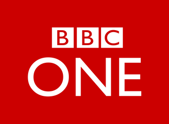 Corporate Design - shape: The BBC One logo is a simple rectangle shape, this connotes a meaning of stability, familiarity, trust and honesty. This relates to the channel as the BBC promote themselves as truthful, trustworthy and honest. font: The font used for the "One" matches that used by the standard BBC logo, which is a simple and clean sans-serif font. This not only creates strong brand identity, but also gives of the feeling that the channel is very professional and high quality and promotes the idea that the BBC is more mature than its rival channels due to it being the longest running channel on British television. The use of a sans-serif font gives the brand a contemporary and modern feel which makes the brand seem fresh and up to date despite being the longest running TV station in the UK. colour: The main colour of the BBC One logo is red, which connotes power, strength, determination and passion. The font on the logo is written in white, which connotes purity, goodness, cleanliness, safety and perfection. These colours relate to the channel as the BBC is the strongest channel on British television due to its role as the primary channel, it also promotes itself as truthful, determined and pure. size: The BBC One logo is often shown to be quite small in relation to the imagery around it. This works because the logo is not heavily detailed, meaning that the logo in full detail can be seen and understood even when the logo is small. The fact that the logo is effective even when it is small shows that the logo is highly mature and sophisticated to the point that audiences can identify the brand without needing a large or obtrusive logo. information: The BBC One logo contains very little information about the channel. The standard BBC logo is present so as to tie the channel in with the BBC's brand. The lack of information on the logo relates to the BBC as it demonstrates the cleanliness that they promote themselves with. Who is the target audience - BBC One attracts a large audience with a variety of interests and views. The channel airs a number of different types of programmes so as to attract as big and diverse of an audience that it can. How the logo shows the target audience - The logo does not specifically target any one part of its target audience, but instead projects itself to the whole broad target audience and maintains a clean and open feel. How it links to the channel's identity - BBC One promotes itself on the idea of cleanliness, stability, honesty and trustworthiness, the logo reinforces this through its shape, colour and font choices. Logo 2 - Channel 4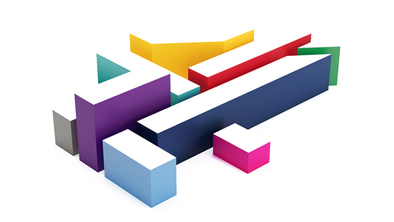 Corporate Design - shape: The shape of the channel 4 logo directly follows the shape of the number 4 but divided into small segments, each at different levels of elevation. This is quite a complex and unique shape, which ties into the idea that channel 4 is a unique channel in terms of the programmes it airs, many of which are programmes bought from American companies, and that it was one of the first publicly owned channels on British television. font: The font used for the channel 4 logo is a type of sans-serif but broken into small chunks to form the design of the 4. This, again, is very unique and links to channel 4 being different to it's competing channels due to the nature of its public ownership. colour: The channel 4 logo uses white as the colour at the top of each elevated section of the logo, while the sides are all in a different colour each. The use of so many different colours links with a sense of diversity and inclusion which shows that they are trying to relate themselves with a diverse target audience. size: Many of the new channel 4 idents do not include the logo, however the few that do have only the logo on screen where the logo takes up nearly the whole screen, with some space around the edge to allow motion and actions to take place on and around the logo. This logo is slanted at an unusual angle. The reason for this is unclear though it was probably done to emphasise the specific coloured block that relates to the channel the ident is being shown on. information: The channel 4 logo does not include much in the way of detailed information relating to the brand. The logo is however used to represent each sub-channel of their network; such as E4, More4 and Film4, along with other channels; with each different coloured block taking the lead action to represent a specific channel. Who is the target audience - According to their website, Channel 4's target audience is roughly 16-24 year olds in the UK. How the logo shows the target audience - The logo links to the target audience as it is quite modern, diverse and clean. This links to the target audience as, the targeted age group is of a modern and diverse generation that are either preparing to go into, or are in their first roles of employment or further study at university or apprenticeships. How it links to the channel's identity - The logo links to the channel identity as Channel 4 is quite a unique and diverse channel which is shown through the shape, font and colour choices on their logo. Channel 4's ethos is to "foster the new and experimental in television. It will encourage pluralism, provide a favoured place for the untried and encourage innovation in style content perspective and talent on and off screen" The logo links to this as it is experimental and unique compared to the logo's of Channel 4's competitors. Logo 3 - Dave
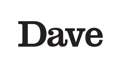
Corporate Design - shape: The Dave logo follows the shape of the word Dave, though sometimes the logo is shown with the addition of a circle around it. The circular logo has connotations of well-roundedness, completion, and eternity as well as energy and power. font: The Dave logo uses a serif font which looks sophisticated and professional. This links to the channel as Dave promote themselves as the primary hub for intelligent humour, or as they put it, the home of witty banter, it does somewhat clash with the brand idea, however, as the font used doesn't immediately promote the channel as a comedy channel. colour: The predominant colour of the Dave logo is black. This has connotations of power, elegance and formality, though the colour usually has more negative connotations such as death. This doesn't really fit the brand or promote Dave as a comedy channel. size: The Dave logo constantly changes sizes between all of the channel's idents and promotional material, though the logo is usually placed in the scene on another object rather than being overlaid onto the screen. information: The Dave logo does not include any additional information about the channel, however, it is sometimes shown alongside the promotional slogan "The home of witty banter". Who is the target audience - Dave's target audience is 16-34 year old "upmarket men", though their commissioning brief states that they must not alienate females as 40% of their audience is female. How the logo shows the target audience - The logo shows the target audience being "upmarket" through the use of a sophisticated and professional looking serif font and through the use of the colour black. How it links to the channel's identity - The logo links to the channel identity as it carries the same sense of sophistication and wit, however the logo alone fails to carry the sense of humour and comedy that the channel is known for. Logo 4 - Comedy CentralCorporate Design - shape: The comedy central logo is a very round shape as it follows the shape of a C wishing a larger, backwards C. font: The font used is a simple sans-serif font, which connotes simplicity and modernity. The outer C and the word central are also reversed, which adds a wacky and humorous theme to the logo. colour: The logo is completely in black which connotes power, elegance and formality, yet is often associated with negative themes such as as death, which, once again doesn't fit the theme of a comedy channel. size: The comedy central logo usually takes up most of the space on screen during their idents and, on occasion, sections of the logo, mainly the double C shape, fills the entire screen. information: The comedy central logo does not include any additional information about the channel. Who is the target audience - Comedy Central's target audience is adults and men from the ages of 18 to 49. How the logo shows the target audience - The logo links to the target audience as it is wacky and weird yet is sophisticated with a sense of elegance. How it links to the channel's identity - The logo's weird and wacky design relates to the channel's identity as it ties in with the comedy theme, which is especially fitting for comedy central compared to other comedy channels as it is known as the only all comedy network and strives to be the top provider of comedy programming. Logo 5 - ITV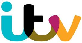 Corporate Design -
shape: The ITV logo follows the shape of the three letters that make up the abbreviation of ITV. font: The ITV logo is written in a form of rounded and curved sans-serif font,which connotes simplicity, minimalism and modernity. colour: The ITV logo is made from a range of "hero" colours that span the entire colour spectrum, which suggests the network airs a broad range of content. Each ITV channel also has a main colour, such as purple for ITV 3 and red for ITV 2. size: The ITV logo often takes up a large portion of screen space on idents or online. This makes the logo stand out against the surrounding imagery. information: The ITV logo is not accompanied by any additional information, which keeps the logo looking simplistic and minimal, which fits with the theme of the brand. Who is the target audience - The ITV network has a broad target audience typically around the age of 16-34. How the logo shows the target audience - The ITV logos attract the target audience for the channel it is shown on through the use of colours which are typically associated with the kind of programming that channel shows. For example ITV one shows a wider variety of programmes than the other channels in the ITV network, it is the only channel that has multiple colours in its logo, which shows its wide target audience. How it links to the channel's identity - ITV One's logo links to the channel's identity as it is able to provoke a variety of reactions and emotions from all of the channel's broad and wide audience.
0 Comments
|
AuthorWrite something about yourself. No need to be fancy, just an overview. ArchivesCategories |
-
Music Videos
-
Objective 1
>
- Task 1.1: The Purposes of Music Videos Research Log
- Task 1.2: Music Video Conventions
- Task 1.3: Music Video Styles Viewing Notes
- Task 1.4: Music Video Recipe
- Task 1.5: Digital Editing Revolution - History of Editing Timeline
- Task 1.6: Editing Case Study
- Task 1.7: Cinematography Rules
- Task 1.8: Single Camera / Multi Camera TV Comparative Table
- Task 1.9: Single Camera Analysis - OK Go
- Task 1.9: Single Camera Techniques Essay
- Task 1.10: Meaning Conveyed In Music Videos
- Task 1.11: Narrative Theory Glossary
- Task 1.12: NME Videos Analysis
- Task 1.13 A: Music Video Directors & Code of Practice
- Task 1.13 B: Music Video Producers' Code Of Practice
- Task 1.14: Record Label Case Study
-
Objective 2
>
- Objective 3 >
-
Objective 1
>
-
Ident
 RSS Feed
