|
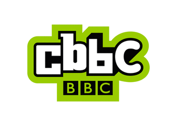
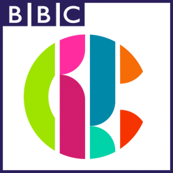
In early 2016, CBBC rebranded itself with a colourful new logo and a new package of idents. This is what the logo used to look like (left) versus what it looks like now (right).
ColourThe new logo contains a larger variety of colours which shows that they are trying to branch out to a more diverse and varied audience. The colours included are the same green used in their previous logo, a brighter and darker shade of pink, a dark blue, cyan, orange and red. This helps to give off the feeling that the channel isn't necessarily "children's TV" but that "it's various iterations are fun and unpredictable and have broad appeal." as Cheryl Taylor, controller of CBBC said. The new CBBC logo shows that the channel is meant to be enjoyable by children and their parents, not just the children, the colours of the logo are, however, very energetic and bright, which reflects the channel's mostly young and energetic target audience. ShapeThe new logo takes the shape of a C, which is a more circular shape than their previous logo which connotes the feeling of unity and symbolises the channel's wide audience range. The new shape is also divided up 4 lines to make up the 4 letters of CBBC. The new shape also makes the logo more suited to a variety of different platforms as it is evenly sized both horizontally and vertically, meaning that the logo will work on both vertical and horizontal screens as well as posters and other non-digital media. Red Bee Creative, the people behind the rebrand said this about their choice of shape for the new logo: "The new logo unites the acronym of CBBC into a singular, cool marque that also solves the problem of duplication of BBC within the logo. Its bold design ensures it works powerfully and responsively in a multiscreen world." SizeThe new logo is smaller horizontally than the previous logo. This is to make the logo more rounded and evenly sized both horizontally and vertically, which can be seen by the square that occasionally accompanies the logo around the outside. The new, smaller and more even size and the new colours make the channel seem more targeted towards kids. Why they rebrandedThe reason behind CBBC's rebrand was to make a logo that was more versatile and more applicable for use on a variety of platforms such as the internet and mobile apps as well as on TV. The other reason for their rebrand was to make their logo more suited to a constantly changing and updating media industry, as the views, interests and beliefs of the people are constantly changing and shifting along with new technology and trends over time. The new logo is also far more colourful than the previous design which makes it seem more like a children's TV channel as it feels more youthful and playful than a single block green. Red Bee Creative, the company behind the rebrand, said this about their approach to their work: "Our strategy was to create a powerful relationship and coherence between the ‘what’ of CBBC - its content - and the ‘why’ of its brand belief: the uniquely inspiring content of CBBC sparks the imagination of kids to make real life more awesome." Does it stick to the channel's corporate identityThe new logo doesn't promote the sense of the channel being a children's television station with this revised logo, but instead focuses on the other element of CBBC's brand, being that their content is fun, exciting, unpredictable and appeals to a broad audience. Any positive / negative feedback from the viewers?As the previous logo had been used for nearly a decade, the sudden decision to rebrand caught a lot of people by surprise.
The new design did have some criticism, some people believed it looked too stylised, modern and minimalistic, but overall the new design was well received and enjoyed by the viewers, who helped to redesign the channel's logo. Red Bee Creative's website has a list of three reviews from young viewers of CBBC that read: “I like it!” LIBBY, 9 “It looks cool!... I think the lines and the new symbol make it look better than last time.” ELLIOT, 10 “The graphics are really good and made it more interesting to see and make you want to watch it a bit more.” CHARLOTTE, 9
0 Comments
|
AuthorWrite something about yourself. No need to be fancy, just an overview. ArchivesCategories |
-
Music Videos
-
Objective 1
>
- Task 1.1: The Purposes of Music Videos Research Log
- Task 1.2: Music Video Conventions
- Task 1.3: Music Video Styles Viewing Notes
- Task 1.4: Music Video Recipe
- Task 1.5: Digital Editing Revolution - History of Editing Timeline
- Task 1.6: Editing Case Study
- Task 1.7: Cinematography Rules
- Task 1.8: Single Camera / Multi Camera TV Comparative Table
- Task 1.9: Single Camera Analysis - OK Go
- Task 1.9: Single Camera Techniques Essay
- Task 1.10: Meaning Conveyed In Music Videos
- Task 1.11: Narrative Theory Glossary
- Task 1.12: NME Videos Analysis
- Task 1.13 A: Music Video Directors & Code of Practice
- Task 1.13 B: Music Video Producers' Code Of Practice
- Task 1.14: Record Label Case Study
-
Objective 2
>
- Objective 3 >
-
Objective 1
>
-
Ident
 RSS Feed
