BBC Four - Library IdentBBC Four's library ident is appropriate to their target audience as it shows very intellectual imagery, as a library can represent a wealth of knowledge and understanding as well as a person's search for knowledge and information, which conects to BBC Four's well informed and intellectual target audience. BBC Four's target audience has an average age of 61 and enjoys documentaries and informative programmes. The screenspace has a very small density of information with only key visual elements included, such as the logo and, in the case of this example, the channel of the year box in the bottom left, while the information area is a smaller rectangle in the same aspect ratio as the ident so that all the information leaves a gap from the edge of the screen. The ident also ties into the channel's brand as the imagery is divided into 4 sections that slightly distorts the motion of the imagery, although it seems to be seamless when there is no motion. The standard BBC logo is also present in this ident, in a very central location. This ensures it is the main focus on screen, this also helps to show that this channel is a branch of the BBC channel group, tying the channel in to the BBC's corporate identity. Sky Movies - Showcase Ident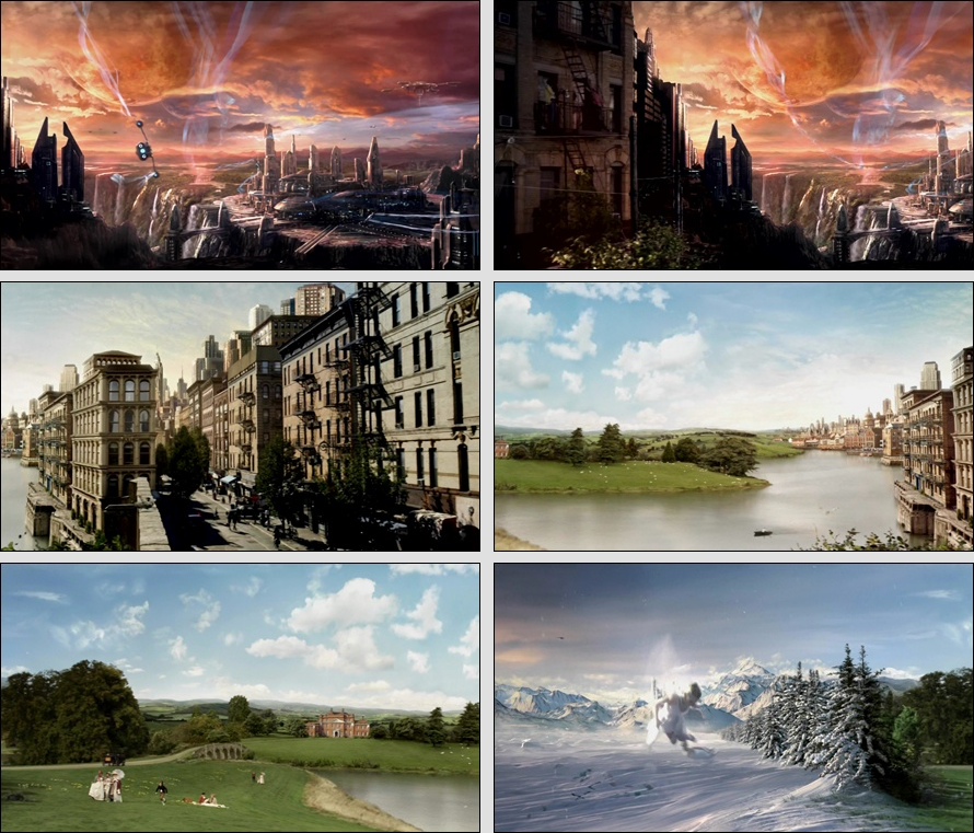 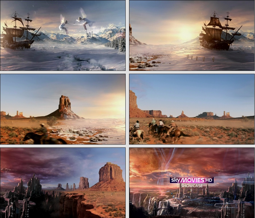 Sky Movies' showcase ident is appropriate to their target audience as it displays a wide variety of imagery that mirrors the types of scenes that are often seen in many popular types of film including a wild west landscape and a dystopian city, this reflects the fact that they show popular, blockbuster and often action packed films which allows the audience to be informed about what kind of films the channel airs which helps them to form the judgement of whether or not the channel is what they want to watch. Sky Movies targets themselves towards kids, teens and family audiences, and this ident links to the target audience quite well as they would prefer more action packed and fast paced films, of which the ident contains imagery of. This also ties into Sky Movies' brand as, like their name suggests, they almost exclusively air movies, therefore the compilation of movie-esque imagery Phoebe Seston ArticleThis article is about an ident that the author made to promote the BRIT School and their considerations and review of what they have done. From this article, I have learnt that the music choice for our ident is very important as it must be royalty free or not protected by copyright laws. I have also learnt that the full identity of the target audience must be represented so as to ensure nobody in the target audience feels excluded or alienated. Finally, I have also learnt that it is important to represent the channel in a fair and honest way so that the full identity of the channel can be represented. https://phoebeseston.wordpress.com 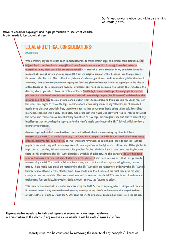 BBC World News After Effects TutorialThis video goes through the steps needed to recreate the BBC news opening and ident. From this I have learnt more about the effects and plugins for After Effects that are needed to create 3D motion and animation. such as CC Sphere and compositing different imagery to create visuals. This has given me a better insight into methods of creating 3D motion. What I have learnt from this may be very useful when creating my channel ident. Article on Chanel 4's rebrandThis article covers the Channel 4 rebrand and the artists involved in creating the updated brand. https://www.creativereview.co.uk/channel-4-rebrands-with-help-from-jonathan-glazer-and-neville-brody/ The article describes the imagery behind the new idents being that they are slightly sic-fi-esque and abstract. The idents apparently make one connected narrative, one which has been left deliberately vague so that the channel can elaborate upon it with later idents. 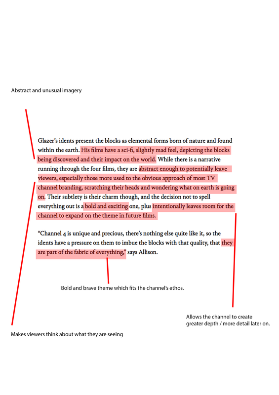 From this I have learnt that subtlety and not making the key themes blatantly obvious can really help make the narrative more interesting, which could be useful if the ident I create is strongly narrative driven. Horseferry & Chadwick - Channel 4's new typefaces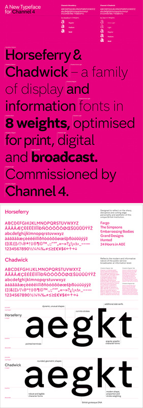 This is the demonstration of Channel 4's new typefaces, Horseferry and Chadwick. The creation of these fonts was commissioned by channel 4 for them to use for their presentation and information. These help to create a stronger brand for channel 4 as they are the only people who use this font, due to it being created specifically for them, this means that people will immediately relate this font to channel 4, which is a sign of a strong brand. It is useful for a channel to have a unique elements to them, such as a typeface, as it helps to make their brand stand out among their contenders and makes people remember them more. Channel 4's 2004 idents vs 2015 idents.2004:  2015:  Channel 4 repackaged themselves in September 2015, though they kept the same brand image and theme. They managed this by keeping their weird and abstract imagery, this time with mass amounts of blocks as oppose to floating sections of their 4 logo. These idents did slightly alter their audiences perception of them to be more fresh and modern, though not to the extent of drastically changing their image. Channel 4's new package gave them a fresh new look, stronger interest in their channel and a stronger overall brand image. BBC One main home pageI looked at the BBC One home page as it is another form of corporate communication alongside their advertisements and idents. 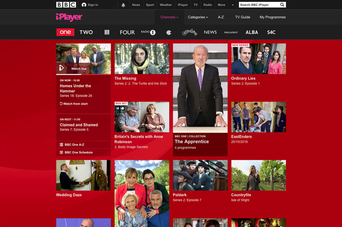 BBC One's main page on the BBC IPlayer showcases some of the channel's most popular programmes and what programme is currently live on TV.
The website ties into BBC One's image and brand as, it not only showcases what viewers should watch, bus also has the channel's main colour scheme of red and black, which helps viewers to relate that imagery with the channel and ties the website into the channel's corporate identity.
0 Comments
|
AuthorWrite something about yourself. No need to be fancy, just an overview. ArchivesCategories |
-
Music Videos
-
Objective 1
>
- Task 1.1: The Purposes of Music Videos Research Log
- Task 1.2: Music Video Conventions
- Task 1.3: Music Video Styles Viewing Notes
- Task 1.4: Music Video Recipe
- Task 1.5: Digital Editing Revolution - History of Editing Timeline
- Task 1.6: Editing Case Study
- Task 1.7: Cinematography Rules
- Task 1.8: Single Camera / Multi Camera TV Comparative Table
- Task 1.9: Single Camera Analysis - OK Go
- Task 1.9: Single Camera Techniques Essay
- Task 1.10: Meaning Conveyed In Music Videos
- Task 1.11: Narrative Theory Glossary
- Task 1.12: NME Videos Analysis
- Task 1.13 A: Music Video Directors & Code of Practice
- Task 1.13 B: Music Video Producers' Code Of Practice
- Task 1.14: Record Label Case Study
-
Objective 2
>
- Objective 3 >
-
Objective 1
>
-
Ident
 RSS Feed
