|
Colour is extremely important in a logo as it can dictate the way the audience and customers feels about a brand, so if the use of colour on a logo doesn't carry across the same feelings that the brand's merchandise, or in this case, programmes, then the audience will lose the sense of flow and consistency with the brand, which can often cause them to lose interest in it. Therefore, great care much be taken when choosing the colours that will represent a brand. Colour creates meaning through the emotions that they make the audience feel, for example the colour red gives off feelings of energy, strength, power, passion and determination and is a very intense colour, whereas green gives off feelings of growth, harmony and fertility and is a very calm colour. Colours can relate to a target audience by carrying connotations to represent the target audience or their lifestyle. Colours can relate to a channel's identity by representing the emotions or energy that the target audience should feel while watching the programmes that they air, or by representing the channel's outlook upon society and the world. Logo 1 - BBC Three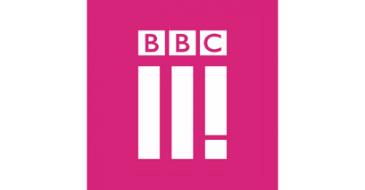 The main colour of the BBC Three logo is a bright purple, almost hot pink, which has connotations of stability, power, luxury and ambition. Apparently, nearly 75% of pre-adolescant children prefer purple to any other colour, ontop of this, bright/hot pink carries the feeling of child like innocence, which ties into a part of the channel's target audience, though pink is more of a feminine colour, which has the possibility to alienate some of the viewer base. Logo 2 - E4The E4 logo also has purple as it main colour, though this is a more solid and standard tone of purple. This carries many of the same connotations as the previous example such as luxury, power, nobility and ambition. This colour links to E4's channel identity as it is a very surreal colour which is often considered unnatural, which ties in to E4's "wacky" brand. Logo 3 - BBC One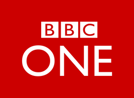 Red is the main colour of the BBC One logo. It carries connotations of strength,energy, passion, and determination. This links to BBC One as it is the longest runing channel on British television and is arguably the strongest, due to its prime position as channel 001, it also makes the brand stand out against competing channels due to the ferocity and energy behind the colour, which can make the audience feel safe and stable with the brand. Logo 4 - Dave The main colour of the Dave logo is black. This carries connotations of power, elegance, formality and sophistication, which are not characteristics often associated with a comedy brand.
The colour carries connotations that relate to formal and sophisticated part of the brand but not so much to the comedy part of the brand, which is arguably more dominant that the formal side.
0 Comments
|
AuthorWrite something about yourself. No need to be fancy, just an overview. ArchivesCategories |
-
Music Videos
-
Objective 1
>
- Task 1.1: The Purposes of Music Videos Research Log
- Task 1.2: Music Video Conventions
- Task 1.3: Music Video Styles Viewing Notes
- Task 1.4: Music Video Recipe
- Task 1.5: Digital Editing Revolution - History of Editing Timeline
- Task 1.6: Editing Case Study
- Task 1.7: Cinematography Rules
- Task 1.8: Single Camera / Multi Camera TV Comparative Table
- Task 1.9: Single Camera Analysis - OK Go
- Task 1.9: Single Camera Techniques Essay
- Task 1.10: Meaning Conveyed In Music Videos
- Task 1.11: Narrative Theory Glossary
- Task 1.12: NME Videos Analysis
- Task 1.13 A: Music Video Directors & Code of Practice
- Task 1.13 B: Music Video Producers' Code Of Practice
- Task 1.14: Record Label Case Study
-
Objective 2
>
- Objective 3 >
-
Objective 1
>
-
Ident
 RSS Feed
